Learn Techniques for Customizing Your Lettering Animation Beyond the Basics 🎓

In part one, you learned how to take your monoline lettering from vector to smooth animation in under 60 minutes. Now I want to teach you some new techniques. Most are basic techniques and a couple are a little more advanced. If any of these are over your head, it's totally alright to stick with practicing the basic ones before moving on.
Goals
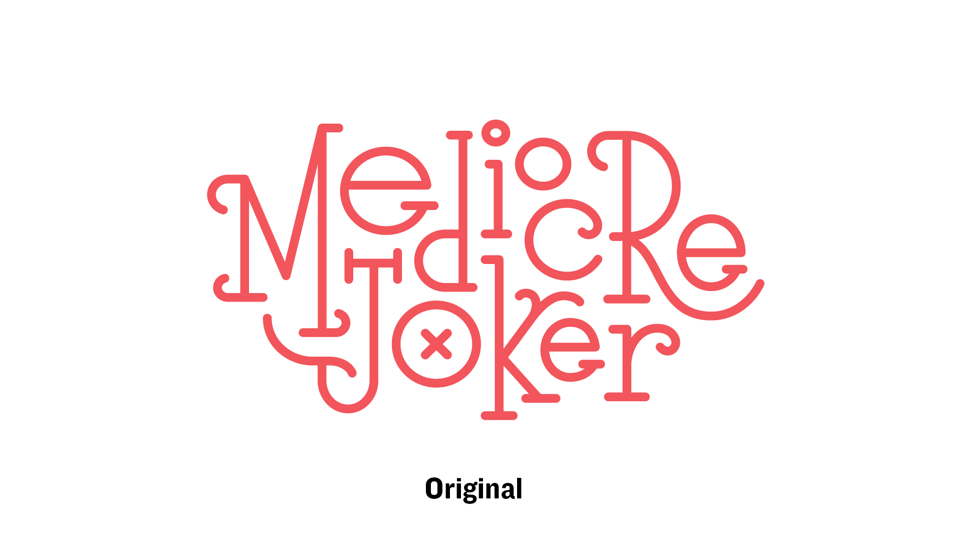
I took the goals that Eric Friedensohn set for the lettering design and translated them to animation goals.
"I wanted the lettering style to feel fun and bouncy, to match the humor in the content of the piece mediocre joker."
That definitely works for animation. For each letter, I focused on bringing it onto screen in a fun and bouncy way.
Straight Ahead Animating
The way I approached this more customized version was a technique called Straight Ahead. This typically refers to the way beginners naturally start animating walk cycles. They begin with the first pose and just draw the next frame, then the next, then the next, and so on, which can result in wonky walks. While this is not a proper way to animated walk cycles, it works perfectly well for lettering motion design.
I began with the "M" and went from there. Each letter after the "M" was based off the animation of the letter before it. For instance, I used the overshoot and bounce strokes to trigger several letter's animations.
The reason this works rather well is the letters have a visual reason to start animating. There doesn't need to be a strict trigger for every single movement, but it was helpful to let that trickle through the whole animation.
Overlaying the Original
In Illustrator, I extended some of the strokes to do the Overshoot and Bounce technique, but I didn't want to lose the original composition. So I just duplicated the strokes and created a 50% transparent copy to keep on top so I would know where to have the strokes come to rest.
Accent Line Extensions
The "M", "J", "o", and "R" use this technique. These are simply created by drawing the stroke beyond the letter form. And using our trusty friend Trim Paths, the stroke animates on from the extension, but then comes back to fit the letterform (matching the original overlay layer).
Trim Paths Offset
This one is quite simple. Combining Trim Paths' Start/End with Offset animation can give you really nice results without a ton of work.
The Offset value just tells the path where the start point is. On a path that's not a closed loop, the start and end are more obvious, but on a circle, you will have to change the Start or End value to see where it begins.
Position and Rotation
Any property on a layer (Position, Rotation, etc.) act the same way as Trim Paths do. When you click the stop watch ⏱ icon, it gives you a keyframe. Move the play head and change the same property value and voila... it animates.
Overshoot and Bounce
This is one of the techniques that's relatively advanced. I will go over the bounce technique in greater detail in a separate post. I just wanted to show you how it can be done.
The springy overshoot is basically the exact same graph editor structure, except the points on the graph alternate... below the centerline, above, below, etc.
Frame by Frame Path Animation
This final technique is not for the faint of heart. I put this here to show you that it can be done more than to teach you how to do it.
And that does it for Part 2.
Here is what we've done so far.

And here's the full piece in video format so that you can scrub through and watch as slowly as you'd like.
Go Forth and Animate
With this handful of techniques, you now have the skills to not only animate your lettering piece, but you can customize it and experiment with all sorts of cool movement.